Effective and Engaging Main Street Websites: Must-Haves, Opportunities, and Mistakes to Avoid
Whether you're considering a new website for your Main Street or Downtown, aiming to enhance your existing site, or simply want to avoid costly and time-consuming mistakes this how-to is for you.
Here we'll explore valuable strategies starting with basic website structure, key content to include, mistakes to avoid and more.
This post builds on our recent webinar A Main Street or Downtown Website That Delivers: Key Elements for Engagement and Impact and our work with over 100 Main Streets and Downtowns across the US - learn more about our Main Street Solutions which can be used to enhance existing websites or we can upgrade your website with our affordable programs.
Below we've included the key highlights from the webinar so you can quickly implement improvements for your Main Street, Downtown, Merchant Association, or Improvement District.
Focus Your Main Street Website's Content & Structure
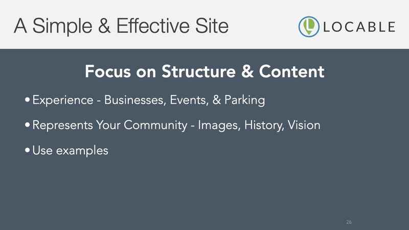
Most Main Streets prioritize local engagement and growing visitors (tourism) which means your website should align with this goal.
The experience your community delivers, or what people should expect, is largely comprised of your businesses, events and activities, as well as the parking situation.
Parking and access can be particularly important for RVers and busses where missing out can cost your community.
It should go without saying but using images that represent your community is critical and it can be powerful to lean into your community's history and the vision you have to build a future thanks to that legacy.
Examples are your best friend, it makes up the majority of the content you can produce and it should be simple and quick.
A Main Street Homepage, Navigation and Other Considerations
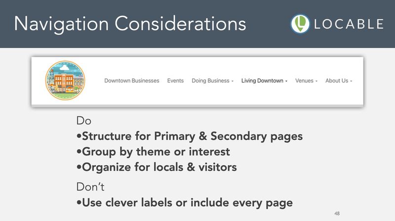
Too often the top navigation and homepage are created haphazardly or they grow unwieldy over time. In reality, the navigation should focus on top-level and sometimes secondary pages... don't overdo your navigation or it becomes useless.
Likewise, your homepage is largely a visual navigation option for people who prefer to scroll and here is where images can make a huge difference.
In all cases, clear and concise language wins - cleverness simply leads to confusion.
Be sure to prioritize your navigation from left-to-right and your homepage from top-to-bottom based on the types of visitors you most want to serve.
Common Problems and Mistakes to Avoid on Main Street Websites
It's easy to get busy and not get to creating content or updating information but many of the mistakes we see are more glaring and could even result in a lawsuit by a litigious visitor with a vision impairment.
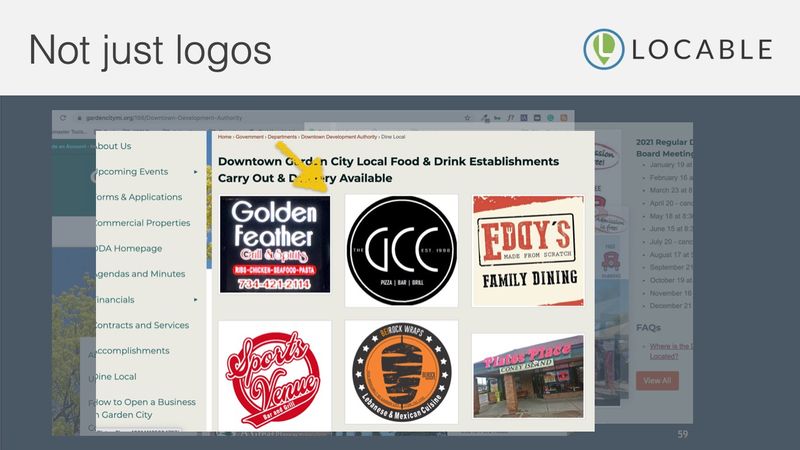
Too often we see people feature graphics that are attractive but not accompanied by text on the page - I'm looking at you Canva lovers ;)
These graphics may be great but they are insufficient and hurt your efforts in a few important ways if not accompanied by text on the page or via Alt-text:
- They're not mobile-friendly and can't be read on small screens
- They're not Google friendly and you lose SEO if the content is lacking
- They may open you up to a lawsuit related to ADA violations
Some platforms enable you to add Alt-text to images which can be useful for Google and screenreaders - your best option is to do all of it... post the graphic, ensure the text is present on the page, and use Alt-text.
There are a host of other shortcomings we see consistently including:
- Highlighting Main Street America's 4-Point Approach without context
- Too much text on the homepage or primary pages as well as poor formatting resulting in "walls of text" which aren't scannable - simple text formatting is transformative
- Having your "website" as a series of pages on the city's site, the chamber's site or buried in some other place - you need your OWN site
- Having limited resources i.e. no directory, calendar or resources that are not useful - we get it, they can be time-consuming without Locable's automated community calendar tools ;)
- Adding links between pages and calls-to-action helps to drive the behavior you're after
- While publishing your email address results in you getting more spam, a form-based approach to everything is recommended and streamlines your processes for event registration, vendor registration, volunteer registration and more
- And for goodness sakes, secure your website
Related: Explore Locable's Event Registration & Other CRM-based Form Tools
The Importance of a Community Calendar
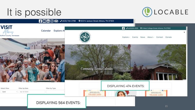
The majority of communities that contact Locable do so because they want to improve their Community Calendar and our community calendar solution is unmatched in terms of automation and collaboration.
We've done separate webinars and how-to's showing how to implement a great calendar on autopilot, we've highlighted key local community partners for your calendar, and we've outlined the 17 reasons your calendar sucks or sucks the life out of you.
A resourceful calendar and a robust business directory can transform your website and your community.
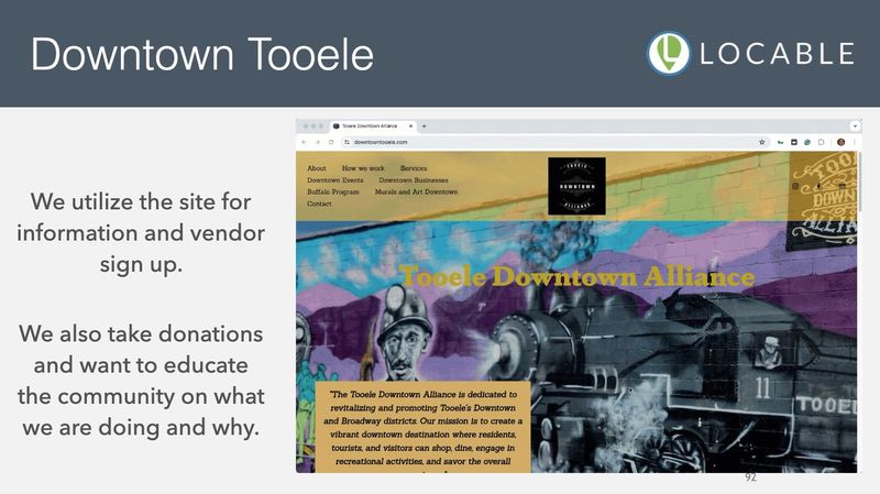
Nothing is quite as educational as seeing real-world examples of Main Street websites including the things they do well, clever solutions and gimmicks, and the opportunities they have to improve.
That tail end of the webinar was dedicated to a real-time review of 4 different Main Streets with different objectives and challenges.
Watch the Main Street Website Webinar
Your website is the key to success and sustainable success at that.
When done right, your website will help you break free from the tyranny of social media and the treadmill it represents so that every activity delivers value today and continues to bear fruit into the future.
Watch the Recording of A Main Street or Downtown Website That Delivers Now >>
5.0 (117 Reviews)
Locable
Folsom, CA 95630
916-585-8468
www.locable.com